


More data doesn’t automatically make an assessment better — it depends on what the extra data is
actually doing. A few different things get lumped under “more data,” and they’re not all the same kind of
improvement.
Coverage is the obvious one. No single public dataset covers everything a site assessment needs — flood
risk, mining legacy, contamination history, ecology, and heritage constraints are all held by different
bodies, mapped differently, and sometimes not mapped at all in a given area. GeoScreen queries around
twenty separate sources per report for that reason, not because more is inherently better, but because
each one covers something the others genuinely don’t. Missing one isn’t a rounding error, it’s a real gap.
Agreement between sources matters more subtly, and arguably more, than raw count. Where two independent
datasets point the same way on the same question, that’s worth something a single source alone isn’t — and
where they disagree, that’s usually worth looking into rather than quietly picking one and moving on. It’s
part of why every rating GeoScreen produces carries a confidence level alongside it, not just the rating
itself. A Low risk rating backed by several consistent, independent sources isn’t the same statement as a
Low rating backed by one source that timed out and fell back to a default — even though the printed word on
the page looks identical either way.
Then there’s resolution, which is a genuinely different kind of “more” — not more sources, but finer
detail within one. A dataset mapped at a coarse national scale can tell you a hazard type exists somewhere
in the general area. It can’t tell you whether it sits under the actual building footprint or four hundred
metres away, because the map was never drawn to answer that question. Finer-resolution data can. That’s the
actual difference between screening-level information and something detailed enough to locate and define a
risk on a specific site — and it’s why more detailed geological data needs a materially different way of
being sourced and used than the free, open mapping a fast screening tool can query live.
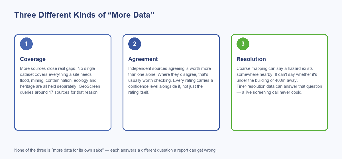
None of this is an argument for piling on data for its own sake. More low-quality or redundant sources
don’t help, and adding sources just to pad out a report is optimising for the wrong thing. Coverage closes
real gaps, agreement across sources earns real confidence, and resolution answers a genuinely different
question than a coarse map ever could — worth knowing which of the three is actually doing the work
whenever “more data” gets used as a selling point, GeoScreen’s own included.
